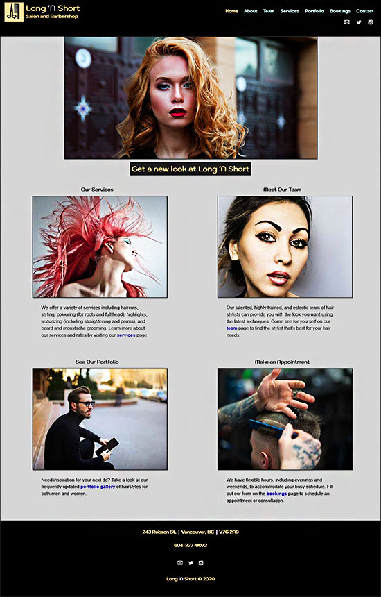
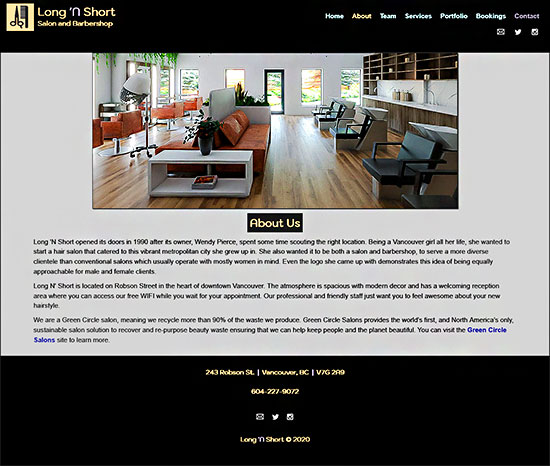
Page Designs
Home
About
Team
Services
Portfolio
Bookings
Contact
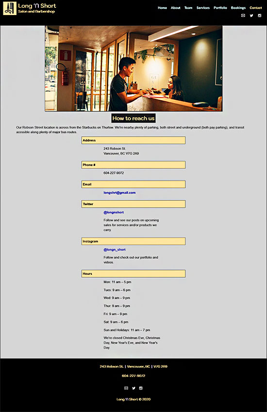
This project was completed as an assignment for a course on jQuery Mobile. The subject was of my choosing. I chose to create a site for a hair salon/barbershop. Below is a list of key features.
Technologies applied: HTML5, CSS3, jQuery, jQuery Mobile, Responsive Web Design, and Photoshop


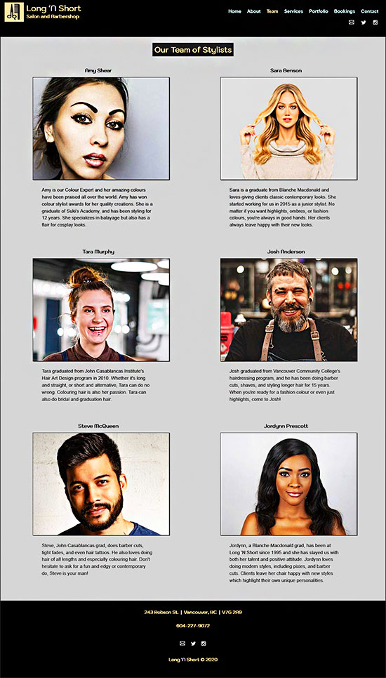
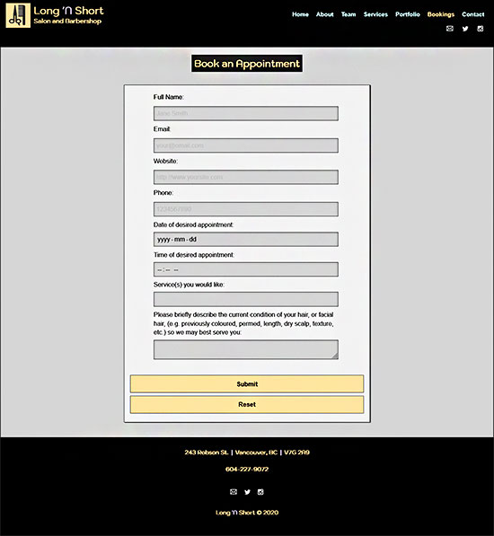
Below shows how the indicated page layouts display on iPads and Tablets.
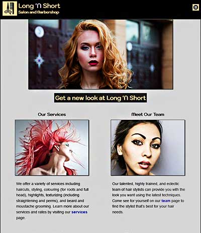
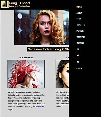
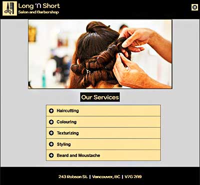
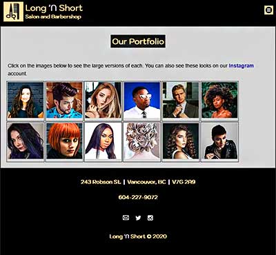
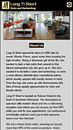
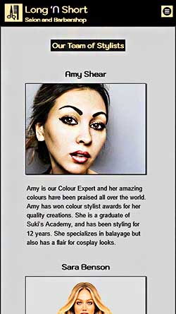
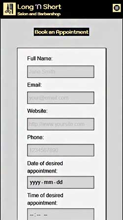
Below shows how the indicated pages, including the slideshow, display on smartphones.
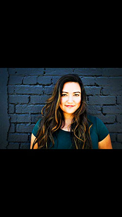
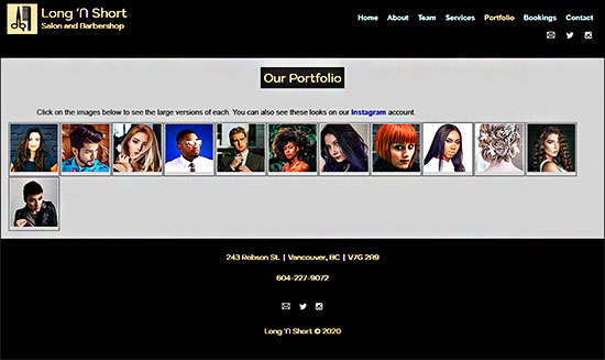
The top image is a screenshot of the image gallery, and the bottom image is a close-up of the first image in the slideshow. Users can either click (on desktop or laptop), or tap and swipe (on mobile devices), in order to view the slideshow made with the use of a third-party plugin.

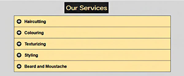
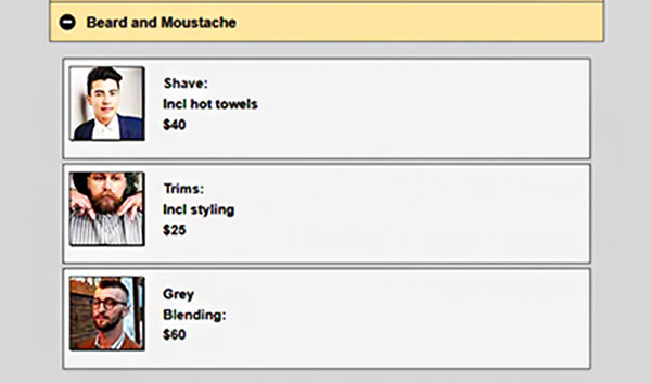
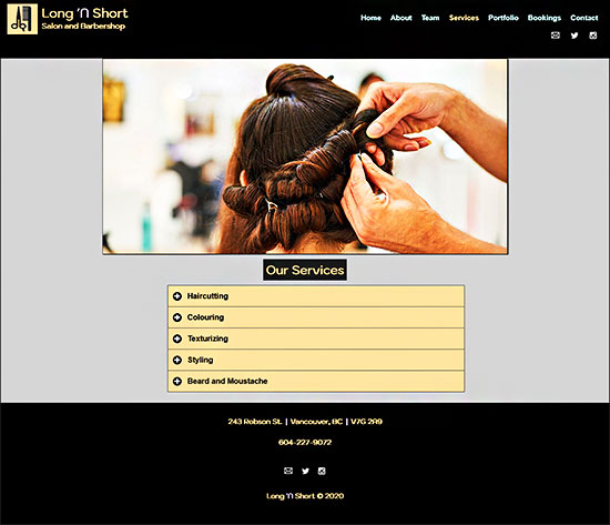
The top image shows a close-up of the services menu. When the user clicks, or taps on mobile, the "beard and moustache" bar (top image), as well as any other yellow bar, a listview of more specific services is revealed with images and descriptions for each one (bottom image). This is useful for formatting content and enhancing design.
